
The human-powered, pedal-driven, single-track vehicle, also know as the bicycle is enjoyed the world over. They’ve been around for a couple of centuries, and there are twice as many bikes as automobiles on the planet. They come in many shapes and sizes, and are very configurable in the real world, so it make sense that they should be configurable in the digital world. Surely it should be as easy as … riding a bike?
Introducing the 3D Bike Configurator concept from the crew at Elementals.
This concept demonstrates some good fundamental principles of 3D product configurator design, mainly for the user experience. To accurately judge if a configurator has been designed well, it needs to be viewed in context with the buying decision process for that particular product. I’ll discuss this in more detail in a future post, including other considerations such as some of the inter-dependent technologies, the customer needs and the business needs. For now, I would just like to focus on the user experience.
The 3D Bike Configurator has Android and iOS apps, and there is also a web version. I tried the web and iPhone versions, and I found both to be completely consistent. The configurator was built with the Unity game engine which publishes to most platforms, hence the uniformity. At this point, it’s worth noting that Unity is a solid weapon of choice for developing 3D configurators based on it’s ease of use, the ability to publish to a large number of platforms, and the future direction of the company’s business strategy. More on that in another post.
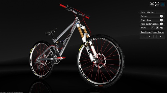
Here is a configurator that achieves the main goal of what it sets out to do, in a simple and intuitive way. From the outset, you have a very clear view of a pretty realistic looking bike that you can study by rotating and zooming in and out, to get a feel for the physical form of the bike and the materials attached. That’s a good start in itself. Many configurators make the 3D navigation over complicated by requiring you to click on icons, which makes it cumbersome to use.
The 3D bike stands on a polished black floor in a dark environment which works well as it sets a stylish mood as opposed to a clinical white environment. It can sometimes be difficult to see black parts on a black background, but because it’s interactive 3D, the rotations help describe the various bike shapes. Elementals have created an HTML5 demo of another bike part (the SRAM X9 9-Speed Rear Derailleur), which improves on the background concept using a more common approach which is typical of product photography. When creating a photorealistic visualisation, the environment is more important than you think. The more real world cues the more you will sell the realism, so having a product in an environment that feels real (which includes having it grounded, having floor shadows and reflections, realistic lighting effects and using a believable 3D room or environment image), is worth spending some time on.

The interaction is what I like the most. The main menu has minimal options, and it easily appears and disappears at the click of a button, so it’s not intrusive while you are configuring. This main menu is placed in the top, right of the screen, which means initially your eyes are directed to the bike, before the menu options. A nice touch in terms of graphic design principles to influence the order of flow. The menu option names are clear, they make sense, and selecting them works as you would expect.
Selecting the “parts customisation” option displays a set of blue “plus” icons that are attached to various parts of the bike in 3D space. This is one of the strengths of using 3D because it is a powerful, non-invasive way of indicating that parts of the bike can be configured (or have information attached to them). My favourite bit of design here, is what happens when you press one of the icons. A lovely circular colour menu widget appears. It’s refreshingly different from the rectangular menus we are so accustomed to, and it is immediately obvious how to use it. It sounds strange, but it’s a pleasure to select from it. This combination of icons and pop-up menus can then be used to customise the the various parts of the bike. Most of the customisation is based on changing colour, but you can see the potential to change sizes and actual specific parts.
Another really useful design feature is the ability to view “guides”, to see all the important dimensions for the bike. This demonstrates a powerful feature of using 3D for product visualisation as it allows you to show real-time information as you configure the shape and size of parts. This is extremely complex using many other types of technology, so this is where 3D Configurators are really one of the best solutions for this level of displaying dynamic information.
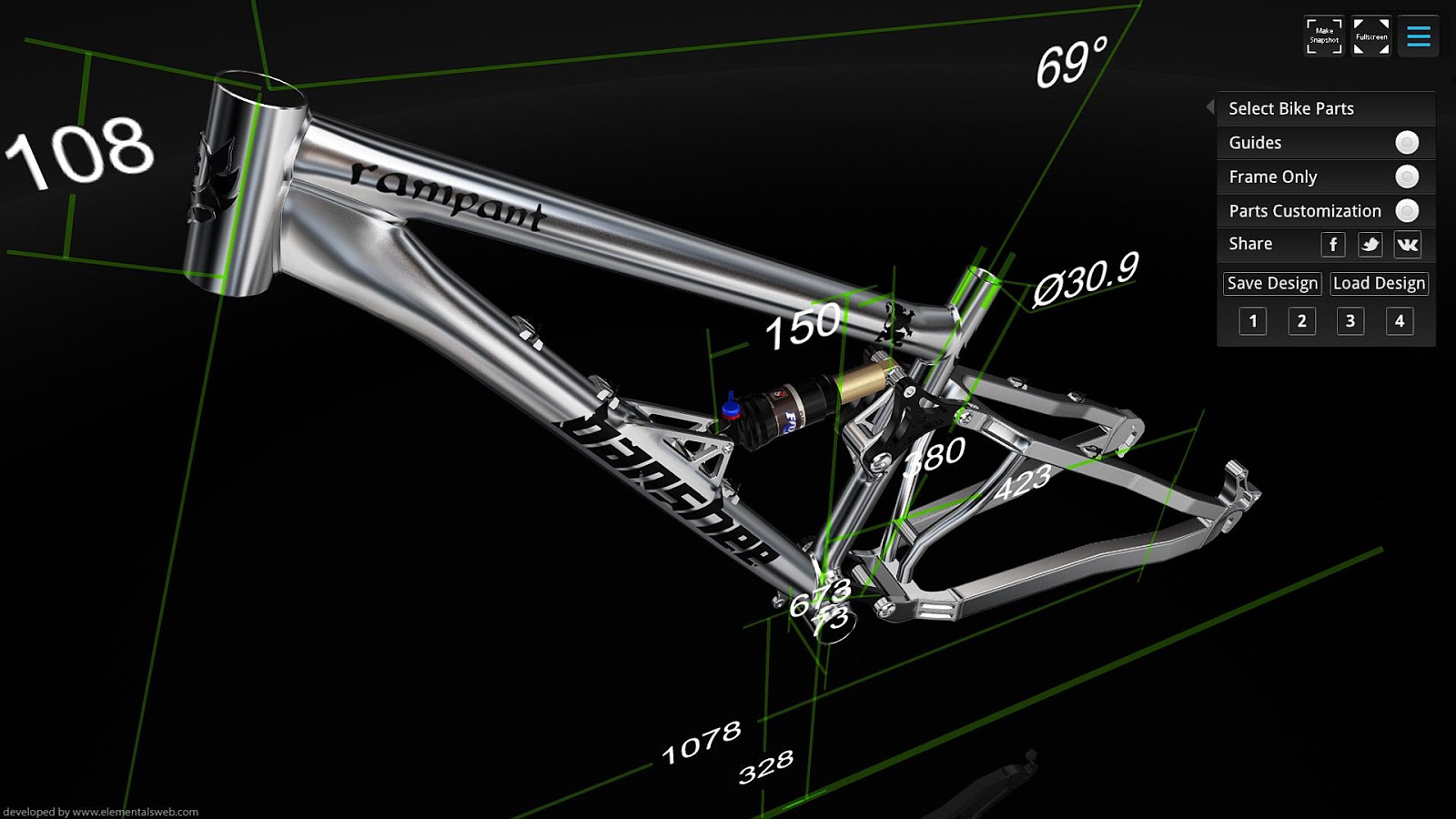
Beyond that, there is a menu option to view the bike’s “frame” by itself. This demonstrates the ability for a user to be able to view parts (or features) in isolation, without the rest of the product getting in the way. So, with all of these basic features, you can sit there and customise away, and when you are happy with your design, take a snapshot, save your design and share it with others.
I would like to point out one part of the design that is common for many 3D configurators, that I feel takes away from the usability more that it adds. When you rotate around the bike, and want to stop at a particular angle, the bike continues to rotate briefly beyond where you stopped. This makes it difficult to study the bike, especially up close. Trying to match what you would like to do in the real world is the key here. It’s the equivalent of holding a product in your hand, and as you move it around to look at it, you stop on certain angles to take a closer look.
As this configurator is more of a concept, the intention of this review has been to discuss some design fundamentals executed well and not to critique every part in great detail. If this was a full blown final product, then it would be more appropriate to analysis it’s functionality in context with it’s intended purpose to ascertain if it adds value.
All in all, well done to the Elementals team for putting together a very promising design that I hope to see grow into an application for many to use. I think many 3D product configurator designers would benefit by using this as a good starting point for their own user interaction design. Bring on the Dandy Horse Configurator!

Pingback: Porsche 3D Configurator Part 2 – User Experience | 3D Product Configurator Design