3D Product Configurator Design

Exploring the design, value and landscape of 3D Product Configurators.


Leave a comment

3D Shed Configurator from IdeaRoom Tech

Finally, someone has designed a good looking shed!  Not only that, a good looking shed that you can customise.  Not only that, a good looking shed that you can customise from within your existing shed!

Everyone knows what your typical bog standard shed looks like.  A Google image search quickly reveals that they are not the most attractive of external household appendages.  One of the biggest dilemma’s when designing your perfectly landscaped garden, is where and how to fit in that goddamn unappealing shed!

Wouldn’t it be great if there were more options, better designs and the ability to customise your own shed.  Well, Studio Shed is one company that has grabbed that opportunity and taken it to the next level using cutting edge 3D technology.


A garden shed is a perfect product for customisation due to the unique needs customers and their gardens have.  The simplicity of a shed’s shape and materials make it a great practical candidate for a product configurator.  I’m glad IdeaRoom Technologies has grabbed hold of this opportunity, and created the Studio Shed Configurator.

StudioShed01
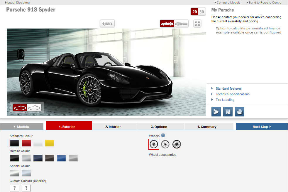
https://3dconfigurator.wordpress.com/2014/07/28/porsche-car-configurator-high-expectations/

Studio-sheds are a modern concept in designer sheds not made from the standard types of wood typically used for sheds.  I won’t go into the details of the the materials as it’s not relevant to the configurator discussion, but if you are interested, here is a link to the Technical Specifications.  It’s enough to know, that the materials and manufacturing process are designed in such a way that it enables the customer to be flexible about their specific design.

It’s worth noting at this early point, that to enable a 3D product configurator to be created, it needs to go hand-in-hand with the ability for the company to cost-effectively build the various possible combinations.  That might sound obvious, but for existing products, often the process needs to be re-engineered to allow a smooth customisation workflow.

Let’s take a closer look at this particular configurator, using the criteria I’ve defined in the past for reviewing 3D Product Configurators; Purpose, Product Visualisation, User Experience, Application and Innovation.


Purpose

The main purpose of this configurator is to allow a buyer to explore and select various shed customisation options to visualise the size, shape and colours of how those combinations look together with the intention of calculating a price to then go on and purchase.

Product Visualisation

In the last post I spoke of some of the key uses for interactive 3d technology for products.  It points out that the technology can be used in many ways, and photorealism isn’t always necessary, or practical, based on the intended purpose of the configurator.

This configurator demonstrates that perfectly.  The main purpose here is to use 3D technology to cleanly and simply illustrate size, shape, dimensions, colours and combinations for your custom shed.  Photorealism isn’t important.

With today’s technology, photorealism is costly, and regardless, you still need to see an example of the true materials or a variation of the real product to be certain it exists and is of the desired quality.  Once you have trust in the materials, then the process of playing with combinations doesn’t require photorealism because at that stage you are exploring options.

Now, don’t get me wrong, the more photorealistic the better, but the point is that it’s not specifically needed for all configurators to be of benefit to the customer and to be cost effective to the company.  However, these companies do like to make sure their products look as beautiful as possible, so as long as there are marketing images to complement the more illustrative style used above, they will be on to a winner.

User Experience

Your first impressions might be that it looks a bit basic, but you’d be missing the point. The beauty here lies with it’s simplicity, and as they say, KISS.

StudioShed02There is an incredibly simple and clear layout, and the graphic design easily draws your eye to the product on the left, options to the right and some standard product camera views at the bottom.

StudioShed_View

To rotate and zoom-on the 3D shed is very intuitive with the mouse, and within a few clicks and drags, you have mastered the navigation for the whole configurator.

The options on the right are bold and clear, and when you click on a heading, it elegantly reveals the options within.

StudioShed_Layout

As you click on the options, the 3D model updates very quickly, and often the 3D view adjusts it’s camera position to optimise the view based on your selection.  A nice touch.

StudioShed_Colourt

I found that the more I played with it, the more I enjoyed it and appreciated the effort that has gone in to making it feel so simple, masking the fact it is a very powerful application.

I have mentioned in the past that a full screen immersive 3D experience with menus gliding in on-demand is a good design feature for these configurators, but for this, I think having all the menu options at the ready works because the style and simplicity of the product doesn’t require full screen.

Application

IdeaRoom Tech, the company that built the configurator, has many years experience building software applications, so the architecture is built on a very solid framework.

The core application that the user experiences, has been built from the ground up using WebGL.  This is a very important design decision, because it means the solution is proprietary to them, and they are not relying on a third party, like Unity or Unreal Engine.  More importantly, because it is built with WebGL, it works on most browsers without the need to load a plug-in.  Although it is optimised for WebGL, the application also incorporates a non-WebGL approach for legacy browsers.  In this case product images are rendered on s server but the same configuration options are available.

IdeaRoom has recognised that building a configurator is best created as a software application from the bottom up as opposed to being built as a product visualisation marketing tool, starting from the top down.

Innovation

I think this is a very innovative application, particularly because it’s been custom build and has a unique visual style, layout and code-base to create a very simplistic configurator.  The ability to use it on many platforms with no-plugin is a key innovation.

StudioShed03

Summary

All in all, I believe this configurator achieves it’s purpose and therefore is a successful example of a solid 3D product configurator.  It is exactly the type of example I’ve been looking for which finds the right balance between visual value, usability and practicality.

From my research, it’s become obvious that 3D digital product configuration is really the only way to easily view multiple customisation options for a product, so with that in mind, I think more applications should think about the value of ‘viewing combinations’ over ‘photorealism’.

IdeaRoom has a few other projects in the pipeline so I’m looking forward to seeing more from these guys and I’m glad they’ve been able to shed some light on an alternative approach to 3D configurators.


2 Comments

LEGO – Augmented Reality vs Product Configuration

LEGO.  Those 4 letters bring happiness to millions of children the world over, and no doubt equally as many parents.  The beloved company that builds the planet’s most popular toy has managed to stand the test of time with it’s unique ability to create a strong emotional connection between it’s products and customers.  The LEGO Group recently became the world’s biggest toy company, and that’s due to the innovative approach they have to reinventing themselves, enabling them to survive for over 80 years.

For such a world leading company, you’d expect LEGO to be at the forefront of the digital revolution, and you would be right.  They strongly believe in the future of customisation, and as a result they created DESIGN byMe some years ago with the vision of a unique customisation service.  This used their own Lego Digital Designer software, which was their version of a LEGO 3D product configurator.

However before I touch on that, I first want to share the main reason for this post, which is to demonstrate an incredible solution LEGO have created for visualising it’s products in-store.  It’s one of the best practical uses of Augmented Reality I have seen (which are completely related to product configurators).

To see how well it creates that emotional connection we spoke of, here is an incredibly professional report from someone not afraid to let out their inner child…

This example demonstrates exactly the type of customer experience that companies want their products to create, to trigger impulse purchases, which account for a large portion of consumer spending.  This goes back to my seeing is believing post.

These LEGO Augmented Reality Kiosks were built by global AR leaders Metaio who teamed up with Intel to create this in-store solution rolled out globally in 2010.  To get a feel for the outstanding work Metaio do, here is a short video from CEO and Co-Founder, Dr Thomas Alt.  In addition, here is a case study and press release about the project.

For a taste of how the Intel technology works check out this video.  In essence, Intel used a new type of processor architecture, called Sandy Bridge, to enable the 3D models to be rendered smoothly in real-time, which was something that couldn’t easily be achieved in the past.  It is worth noting, that when designing these interactive 3D experiences, the hardware architecture is just as important as the software architecture.

Although this blog is more specifically focused on 3D product configurators, I wanted to share this innovation to demonstrate that Augmented Reality is a close relative.

There are many ways for a company to bring a product into the consumer’s world, and the use of real-time interactive 3D covers quite a broad domain.  A 3D Product configurator is one slice of that domain, and Augmented Reality is another.  There is a lot of crossover between the two, and there are many other slices of the same domain that exist and also overlap.  With that in mind, here are some key areas of interactive 3D that can be used for products:

  • Photo-real product visualisation – to literally see what the genuine product looks like from any angle showing the true form, materials and lighting.
  • Viewing a product in context (Augmented Reality) – to see what a product looks like in the real world where it might be used.
  • Immersively engaging with a product (Virtual Reality) – experiencing the product by stepping into a full 3-dimentional world with stereo vision and depth perception.
  • View a product in use – interacting with a product which animates to display features and usability.
  • Interactively view product information – display product specifications, measurements, information and instructions in a more intuitive and on-demand fashion.
  • Product configuration – use interactive technology to visualise any possible combination of parts, options and materials to create your perfect customised product.

Lego seems like a good candidate for digital configuration, and to that end as mentioned above, they created the Lego Digital Designer.  Here is a delightful video of young chap who is thrilled with the software, showing you how it can be used.

This software was part of the DESIGN byMe service which was discontinued in 2012 because, as they wrote “it struggled to live up to the quality standards for a LEGO service”.  I believe the Lego Digital Designer software lives on, and can be likened to a digital version of playing with LEGO.

It demonstrates that people do want to customise, but it’s challenging to make the whole process work efficiently and make the user experience simple, engaging and fun.  Lego were on to something and I’d be surprised if it doesn’t re-emerge at some point in the future in a different form.

To make the 3D product configurators that we will use in the near future, each of the enablers that go in to making them already have existing solutions, they just need to be connected up.  In a future post, I will talk about these enablers.  The solution lies in bringing different worlds together, such as 3D visualisation, engineering and gaming. The key to that is to combine ideas by being open to different perspectives (world views), and allowing new concepts to be born.  This paves the way towards blue ocean markets.

Perhaps if the Lego Digital Designer adopts Minecraft’s approach to using blocks to build stuff, it may see a resurgence in their customisation service…


Leave a comment

Unity3D Car Configurator Concept – by Wensk

After the last mega post, I thought I’d keep this a bit simpler to cleanse the palette.

I came across this Unity3D Car Configurator concept created by a chap named Wensk in China.  After the in-depth look at the Porsche configurator in the last post, the concept here from Wensk actually demonstrates some of the potential user experience possibilities I was describing.

Although this is a concept, I’m sure you can see the great potential here.  In essence, the object we are configuring, in this instance a car, is the core focus of our attention.  We can explore it from different angles, interact with it by opening the doors or exploding out the car panels, and we are not boxed in with multiple menus ‘all up in our grill’.

We can summons the menus at will, with the click of the ‘Menu’ button, and they swoop in non-intrusively.  Even when the menus are on screen, they don’t feel overly oppressive.  I appreciate this is a concept and the number of menus are minimal, but you can see the potential to bring in context sensitive menus as needed based on your selections.

What I like about this is that it’s a bit of fun!  Who says we can’t have music blasting while we personalise our ride.  Who says we can’t have options to turn on and off different parts of that music.  The success of future technology will be in it’s ability to engage users and give them a positive experience.  As me and my old flat-mate use to say when it came to doing the flat admin…”turn it into a game”.

I’m not concerned about the overall style or graphics here, as we know we have the ability to design our own environments, shaders, lighting and menus.  It’s more about the user experience, and the ability to engage people by pulling them into a virtual world and come up with more immersive, intuitive, natural, non-intrusive, engaging and fun ways to buy products.

Thanks for stimulating the neurons Wensk.  Perhaps if we do a mash-up of Porsche and this, we’ll get the sort of result we are looking for.


2 Comments

Porsche 3D Configurator Part 3 – Innovation

To read part 2 of the Porsche 3D Configurator review, click the link below.

Porsche 3D Configurator Part 2 – User Experience

Application

The application itself seems to be a very considered, large scale, solid application that covers all car models, all options, and a very large amount of 3D visualisation, both 2D and 3D.  A tremendous amount of effort has gone in to this, and it feels reasonably robust.  There are small delays while the images update with some of the selections, and this is what we might expect from today’s technology, but in the future we’d like the selections to be updated instantly, especially for comparisons.

Porsche

As far as I could tell, the configurator hasn’t been designed heavily for different platforms or smaller displays, but it is able to detect what platform you are on, and whether or not the 3D plug-in will be available.

Behind the scenes, I can’t comment on the specific technology used but as I’m more interested in the design from a user’s point of view (and I’ve written more than enough already), this blog isn’t too concerned with the specifics of the back-end.  It’s a bonus if I have that information, but the focus is really looking at configurators from the user’s perspective.

Innovation

Initially, I didn’t feel there were many parts of the application that felt ground breaking based on what you may expect with the technology of 2014.  When it was built, it may have been extremely cutting edge and innovative, but I can only judge it on today’s standards because innovation is relative to time.

There is another way to look at this however.  The feat of building a full end-to-end online configurator with every possible configuration and access to all the information and visualise everything (in some shape or form) could be considered by many a great achievement of innovation in itself.  I would like to view this configurator in this way, but when you compare it to Audi City, unfortunately there is quite a large innovation gap.  I’m hoping someone will correct me by pointing me to Porsche’s digital showroom!

That said, to be fair, I viewed online configurators from Audi, Mercedes and BMW and I’m pleased to say, compared to their competitors, Porsche actually stack up very well, and were the only configurator in that group that actually have a full 3D interactive view.  So Porsche are actually showing a lot of innovation on the 3D visualastion aspect of their application

There are definitely a few nice touches that need mentioning.  In the 3D view, the option to turn on the headlights is actually really useful.  The stylised Porshe ‘loading’ graphic is a touch of class.  The ‘play’ in the 3D view is a very good concept.  I’d love to see them build on that with more options during playback.

Loading

Summary

When it comes to product configuration, the luxury car industry is at the top end of the scale for product complexity, quality, customisation, budget and profile.  After taking a closer look at this configurator in more detail, I can now appreciate the challenges involved.

My initial judgement viewed it as a relatively standard offering that didn’t wow the user with innovation.  After spending quite a bit of time getting in to the details and comparing it to some of it’s competitors, the subtle innovation and quality became apparent.

I think we still have some way to go, before we are at home, personalising our next car online in a truly engaging, interactive, photo-real, fluid experience, but this Porsche configurator is a reasonably good step in that direction.

The mechanics of it are very simple, and the visualisation realism just needs some minor tweaks in-line with the technology improvements over time.  Navigating through all the optional extras could use some smoothing out, but all in all, it achieves it’s purpose of allowing the customer to customise and view all the options available to them, and purchase a brand new shiney Porsche.

PorscheTitle

This configurator isn’t what I would call a full 3D product configurator in terms of what I am hoping to find.  I’m picturing being immersed in a 3D space, with inventive ways to view, study, explore and customise parts in a fluid and non-intrusive way.  This is currently shackled by an immense amount of menu options, which dominate the screen.  Let’s invent new ways to engage the user and only bring up options and menus as needed, to allow total immersion.

It’s difficult to know exactly how many people actually use, or even purchase cars through these configurators, so more investigation is needed.

All in all, a very solid offering from Porshe which ‘does the job’, and who knows what they might having racing towards us on the horizon.


2 Comments

Porsche 3D Configurator Part 2 – User Experience


To read the first part of the Porsche 3D Configurator review, click the link below.

Porsche 3D Configurator Part 1 – Visualisation

User Experience

Visually, the Interface is laid out clearly and intuitively.  There are 3 main sections, the visualisation top-left, the price top-right and the customisation options below.  As the eye travels from left to right, top to bottom, this layout flows well.  The graphic design is very clean and white without too many intrusive colours, shapes and borders to distract the eye.

HomeScreen

The customisation options are in a wizard style, so you can focus on one area at a time.  The tabs for each of these steps are very clear, and it’s obvious which section you are customising.  There are option buttons within the product visualisation window, and they are easy to see, nicely grouped around the screen in a non-intrusive way and the icons make it obvious as to what they do.

In the ‘details’ section, there are buttons to ‘Open’, ‘Save’, ‘Print’, ‘Play Engine’ and ‘Download Wallpaper’.  These are very clear, with rollover text to explain what they are.

Overall, with a quick scan of the eye, it’s simple to get started and have access to the full scope of the application.

The Visualisation Window

It’s clear that there is a 2D and 3D mode and easy to switch between the two. The 2D view only has a few options available within the exterior and interior camera angles.  You can switch to a full screen mode (which is just a larger image), and it’s all very obvious how to select these buttons.

VisualWindow_2D

The 3D mode, gives you some additional options, and as mentioned earlier, these are buttons that are very simple to find, use and understand.  Using the mouse, you can rotate and zoom-in to explore all the angles of the car, but you cannot pan the camera left and right or up and down.  This would be useful because currently you can’t zoom-in on a particular area and study it because some car parts go off the screen.

VisualWindow_3D

There is ‘play’ button and this runs through a predefined set of animated camera angles to allow you to sit back and view your selections.  This is not a bad idea for showcasing and discussing your customisation to others.  If you want to use it to have a closer look at certain parts like the wheels for example, unfortunately you are not able to pause, rewind or fast forward to certain parts of the animation.  You have to play it and wait for that camera angle to come around again.

There is an option to go full screen in 3D, and when you do, you get a much clearer view of the vehicle to explore.  This is useful in the showcase mode, and nice to check customisation, but you lose the menus.  It would be nice if you could be at full screen, and have menu options pop in and out like the bike configurator reviewed ealier.

Exterior_FullScreen_Day

The beauty of 3D visualisation is the ability to go beyond the physical limitations of the world.  For the auto industry, it is quite conventional to show ‘exterior’ and ‘interior’ camera angles.  The general issue with interior views is the limited visual range you get from the camera because of the confined space.  With the interactive 3D view, there is no reason why you can’t have an option to hide car panels to reveal the interior, thus allowing exploration in full from slightly further away.  This is the sort of innovation that makes 3D configurators a real value-add.

Customisation Window

The bottom section of the screen is where all the personalisation happens.  This has a tabbed layout which clearly steps you from left to right through each of the customisation stages.  Although this is just one way to layout and group all the options, I think it is a very good choice because we read from left to right, and it guides us in a simple and logical sequence.  At the far left, you start with the ‘Car Model‘ selection page, and at the far right you end with the ‘Next Step‘.  In between, it’s quite simply grouped in a logical order of ‘Exterior‘, ‘Interior‘, ‘Options‘ and ‘Summary‘.

Interior

The ‘Exterior’ and ‘Interior’ sections allow you to select your car colour, wheel type and car seat options in an extremely simple and clear way.  The 2D/3D view visually updates as you make your selection.  The ‘Options’ section is a list of all the optional extras.  At first, I thought this list wasn’t very extensive, but later I discovered that there is a further list of categories to the right.  Each category has it’s own specific set of optional extras, so in total, there is actually quite a large set of possible add-ons.  If the categories were to the left, and not in small grey text, that may have been clearer.

Options_Menu01

For each category in the ‘Options’ section, you are presented with a list of items with a check box to the left and an ‘info’ icon to the right.  There is a broad range of additional extras and the ones that affect the shape of the car, update the 2D/3D view on selection.  As the 2D/3D view is updating, the visualisation window goes grey while you wait, and then the change is applied.  Some of the changes are quite subtle so it’s not often clear that the change has happened, or easy to compare with and without, but regardless, you can view the update in the visualisation window.

Options3 Options2

If you click on an ‘info’ icon, for most items there is an image and a description to go with it.  To selectively go through and discover or visualise each option, can be a bit time consuming, but let’s be honest, I’m sure most people are happy to take their time building their dream Porsche.  The aim for the future would be to allow you to click an option, and see it immediately change in the viewport so you can add and remove parts in a fluid, enjoyable motion.  It’s worth noting however, that although this is an ideal, it’s a very costly avenue to go down, because each add-on is quite bespoke, and the cost-effectiveness of building a configurator that caters for so many options, lies within finding ways to re-use interface elements.  This is why all the car models have similar ‘Exterior’ and ‘Interior’ options, and the ‘Options’ section is based around a list with a link to additional information.

It is impossible to create a sophisticated solution where every part is simplistic.  You have to prioritise where simplicity is needed, and this is enabled by complexity being built elsewhere.  For more information about this, read Edward de Bono’s, Simplicity.  Due to the diversity of optional extras, technology limitations and budget considerations, the ‘Options’ section is simpler for Porsche to develop and maintain, but a bit more complex for the customer to use in a fluid fashion.

Summary

The ‘Summary’ tab is an essential part of the configurator to check your selections, and the associated costs.  Without it, it would be quite cumbersome to walk through all the options and make sure you have selected everything you want.  It’s also a good way to break down the price.  It’s questionable where this summary should live, but in this wizard style tab layout, it doesn’t feel out of place where it is.

Price Section

The top right section shows the summary of the cost, and it get’s updated on the fly as you customise away.  There are also links to more information such as standard features and technical specifications.  There isn’t much to talk about here in terms of user experience, apart from the fact that the information is useful, but because screen real-estate is valuable, does it need this much space?

Price

Overall, a large portion of the screen real-estate is taken up with menus and customisation options.  Due to the technology limitations of this configurator, having menus slide in and out may not have been easily achievable.  If the goal is more about configuring rather than studying the 3D view, then this is a fair enough option.  Usually you don’t want menus getting in your way, but if the menus are the primary focus, then they should take priority.

Porsche 3D Configurator Part 3 – Innovation


3 Comments

Porsche 3D Configurator Part 1 – Visualisation

CoverScreen_FullPorsche is one of those luxury brands that everyone has heard of and most of us desire to own.  I was pleased to discover they have an online car configurator, and based on the company’s image of world leading quality and style, I had high hopes for their offering.

If you are interested in treating yourself, or that special person in your life, to a new set of wheels from Porsche (most of us can probably only afford the wheels) then click here to try it out.

Initially, I didn’t appreciate the complexity of all the possible options any car could have, so this review has turned into a bit of an epic.  As it’s a voyage of discovery, I decided to include a lot of the detail I wrote as we are dealing with a very high-end product, and how I judge, review, observe or comment about these is an evolving process.  If I skimmed over it too lightly, I didn’t feel I would really be understanding the true design, and I’m glad I persued it because my first impression did change by the end.

I’ve broken this review into 3 posts, and if you can take the time to read through, you may get a better appreciation for what goes in to a high-end configurator.

Porsche 3D Configurator Part 2 – User Experience

Porsche 3D Configurator Part 3 – Innovation


Whether you think Porsche’s configurator is good or bad, probably comes down to your taste, but what is important in terms of judging it is ‘does it achieve it’s purpose?‘.

Each 3D configurator can have many different goals, which I will touch on in a future post, but for Porsche, most people are fully aware of the brand’s quality and more often than not, the different car models.  A potential buyer wouldn’t necessarily use the configurator to decide if they want a Porsche, and therefore try to learn and visualise every aspect of it, they are more likely to use it to take their time exploring and playing with all the optional extras for their potential new toy.

CarModel

From my research so far, there are many uses, levels and approaches to 3D configurators, so it’s not appropriate to have a standard measure at this stage by which to judge them all, as it depends on the intended purpose, as mentioned earlier.  With that in mind, I am going to review the 3D product configurators based on the following areas:

  • Purpose – The main goal of the configurator.  What is it intended to enable customers to achieve?
  • Product Visualisation – The lighting, materials, environment, photo-realism and animation of the product on display.
  • User Experience – How well the configurator achieves the above purpose in an intuitive and fluid manner.
  • Application – A discussion about the scope and technology of the full application.
  • Innovation – Putting the spotlight on any particular technological breakthroughs.

Purpose

The main purpose of this configurator is to allow a buyer to explore and visualise all the customisation options, confirm them and place an order.

Product Visualisation

Porsche have created a hybrid 2D and 3D solution, which I touched on in the last post, giving you the option of customising your perfect Porsche whilst viewing a 2D image or an interactive 3D visualisation.  This is a very sensible idea because many interactive 3D applications struggle to work on all platforms, so users should at least be able to configure the 2D version on any browser.

Exterior01

2D Visualisation

You have the choice of viewing the exterior of your selected Porsche from two camera angles, front and back, and for the interior, there is just  one view.  The images are 3D renders that are beautifully lit and retouched to a very high standard giving an extremely clear interpretation of the shape of the chosen Porsche.  Generally, the downside of 2D imagery is the challenge of showing the true form and materials of a product, but in this instance, these have been expertly created.  The images are slightly more hyper-real than photo-real, but they are typical of the type of imagery you would expect in the auto industry.  Photo-realism is more about adding defects, light effects, and camera artifacts which all take away from the clarity and perfection a company wants to portray of it’s product.

2D_Front2D_Back

Car paint is a sophisticated material to emulate in CG imagery because of the complex way the true material reacts to light from different angles.  When creating hundreds or thousands of possible images with all the colour variations, a simplified 2D approach to switch colours is needed to allow a cost-effective way of dealing with the volume.  Often the compromise to efficiency is in the realism of the car paint.  As a result, the car paint materials for these images, doesn’t quite have the realism you need to accurately choose your car colour, but they are a reasonably good representation if you already know your desired colour, and just need to visually confirm it for selection purposes.

2D_Interior

The environment is clean and non-intrusive.  There is no night-time option, like with 3D, but I think that’s OK because for 2D images, the clean studio lighting environment is important to help show the shape of the surfaces.

3D Visualisation

The alternative 3D interactive view is a better way for allowing you to get a good sense of the car’s shape and form.  The lighting positions are slightly less important here because the camera movement itself allows you to evaluate the form and materials.

Exterior_FullScreen_Night Exterior_FullScreen_Day

You have 2 environments to choose from, day and night, which I think is a great idea.  This really helps you visual the car in context and also improves your ability to get a feel for the true shape of the vehicle.  A photographic environment map is really important to help with realism as the reflections on the car help it sit in to the scene.  Both the day and night time environments are well thought out and stylish.

Interior_FullScreen

The car materials aren’t completely photoreal, but they are what we have come to expect from real-time 3D models based on the limitations of photo-real effects.  The car paint suffers the most here, because it is an advanced shader which is difficult to replicate in real-time, based on the way the colour changes as the surfaces faces away from you.

Porsche 3D Configurator Part 2 – User Experience


1 Comment

Bugaboo Baby Buggy 3D Configurator

top_banner_configurator

If you have a baby or you are in the throws of having one, there’s a reasonably good chance you have a bugaboo baby buggy.  We have a baby, and we have a bugaboo.  If that small survey isn’t enough to convince you, then read on.

Bugaboo products are fantastically designed, they look great, they are easy to use and have loads of accessories.  For such an innovative company, it’s no surprise they are ahead of the curve when it comes to better ways to engage customers.  Babies are big business.  You only discover this when you have one, and say goodbye to ever being rich (of course your life becomes richer in other ways).

Enter the Bugaboo Donkey Configurator:

The Bugaboo Donkey Configurator was created in 2010 which shows how forward thinking Bugaboo is as a company, considering 4 years later there are not many companies creating anything close to this.  The configurator does not exist any more due to technical limitations which impacted it’s shelf life, but rest assured, there is a new and improved version due imminently.

To get a better understanding of the configurator, I contacted the Netherlands based company 3DIMERCE.COM who developed the wonderful solution and I spoke with Thuur Crompvoets who is the Account Manager for the company.  He was kindly able to give me some insight into the project and talked me through some of the innovative projects coming up, which hopefully I can share in future posts.

Bugaboo_01This ground breaking flash based project was launched in Spring 2010 and took a team of about 5 people, 4 months to build.  It was a successful online configurator that was then extended to an offline version in Harrods, then more offline versions in retail stores.  These retail versions start to mimic the Audi City digital showroom concept discussed in an earlier post.

With around 1500 possible configurations, it’s a no brainier that the 3D configurator is really the best, if not the only, real practical way to visualise and customise your perfect buggy.

Bugaboo_03At the time it was built, the technology had a few limitations which meant there would be a need to re-design and build a whole new version at some point in the future.  What was missing at the time, was the ability to click a “buy” button and link to a back-end system behind the scenes to place an order.  In addition to this limitation was the issue of supporting flash for the longer term.

As a result, 3Dimerce and Bugaboo kept the dialogue going and after a year or so of discussions, they decided that once the technology caught up, which it did, they would take the configurator to the next level.  As of writing this post, Bugaboo have just released a new and improved version (which will be the topic of a near future post).

Bugaboo_04In terms of design, this configurator was one of the first I came across.  What impressed me the most about it was the photo-realism of the product, the clean, stylish yet non-intrusive environment in which it is placed and the elegant user experience it offered.  From a user experience perspective, it is exactly what I hoped to find doing my research.  It is a well thought out, well designed, engaging configurator that appears to be, as they say, ‘playful’ to use.

The configurator uses 3D imagery and animations that are pre-rendered as opposed to real-time rendering.  This would explain why the imagery looks very real, because real-time rendering still has a few limitations which make the final photo-realism still a challenge to perfectly achieve (although we are not far off these days).

On that note, how important is a fully real-time interactive 3D product visualisation? Do we need to move around and zoom in and out of every part from every angle?   Well, it really depends on the product.

From what I am discovering, there are many ‘integrated’ approached being used to visualise and customise products and whether an interactive configurator uses real photos, video, 3D stills, 3D animation or real-time 3D rendering, it doesn’t matter as long as it achieves it’s purpose.  That purpose is to allow customers to visualise their own personalised product in a way that is cost-effective to the company.  Many sites are starting to use combinations of the above, and the options they choose all come down to budget, team capabilities and technological awareness.

BUGABOO DONKEYI believe real-time interactive 3D is the future and the goal to strive for.  The research so far, suggests that there are still a number of challenges, complexities and costs associated with achieving this, which often means companies almost have to re-invent themselves to take advantage of the future benefits, flexibility and streamlining associated with such a change.  In the meantime, the next practical step in that direction is to have a mixed media solution. Metail.com is just one other example of such a mixed media solution.

As part of this bugaboo configurator, 3DImerce have used a concept they have developed called OneShot.  OneShot is their solution for dealing with 3D product models that can be re-used many times for many different purposes.  One of the biggest benefits of a 3D Configurator is the re-use of 3D assets.  In 3D modelling terms, it’s actually very difficult to have a multi-purpose model for all digital media, especially when it comes from CAD.  Models have to be built in a specific way to allow them to be high or low resolution as needed.  In general, this problem is what I call “the interactive 3D bottleneck” which I will write about in a future post.  Rather than modifying CAD data, 3Dimerce have a streamlined workflow to build their own models using the CAD as reference for dimensions and detail.  These OneShot models can be re-used efficiently, thus saving a significant amount of time, effort and cost.

So as you can see, the Bugaboo Donkey Configurator is a lovely solution which required a reasonable amount of time and cleverness to put together.  Although it had a limited lifespan, it was a technological breakthrough that paved the way for the next generation of more sophisticated configurators.

Just a final thought.  Here’s a Bugaboo Donkey instructional video.  Watching it makes you consider the pros and cons of videoing the use of a product versus an interactive 3D visualisation of the same product.  It seems far simpler to create a video, but can it be re-done consistently for other products in the future?  You can see how this opens the door to the types of considerations needed to help customers view, use and customise products.

I look forward to reviewing Bugaboo’s latest offering in a future post.  If you are in the throws of baby making, I’ll let you get back to business.


Leave a comment

How do 3D Product Configurators work?

In this post, I want to quickly describe the main building blocks that go in to creating a 3D Product Configurator.  My goal is to keep it simple enough for most people to understand, without getting too technical.  I’ve created a simple “back of a napkin” diagram to get the ball rolling.

A 3D configurator is built using the same approach as building a 3D game.  Essentially we are talking about a 3D interactive application, and the process behind the scenes is the same as building any software application, but with a much richer user interface.  The main difference compared to 3D games is that the 3D models are built based on real products, often converted from 3D CAD data, and the configurator has the potential to link to a company’s IT system for placing orders.

Here is a diagram that describes the basic architecture of a 3D Product Configurator.

3DConfig_Architecture3

When the application is in action, it is a continuous cycle of the following steps – display 3D sceneget user interaction – perform an actionupdate 3D scene.  These steps are not too dissimilar to any other software application apart from the fact that the visual display is alive and may continue to move, animate or update.  The input screen serves as a window into a 3D space, which takes you beyond the limitations of a 2-dimensional display, giving you “depth” to play with.

3D World

The 3D configurator starts by having a 3D world that the digital product exists in.  The 3D world is created using 3D applications such as Maya, 3DS Max and Modo, just to name a few key players.  These applications create the 3D models and save them out in a format a game engine can read.  A game engine is then used to import all the 3D models, and create all the interaction using it’s programming language (code).  The game engine is at the heart of the 3D configurator as this is where the 3D assets and programming code come together to form the functionality.

Asset Library

The asset library is where all the objects that are used in the 3D scene live, and often these are just a set of files sitting in a folder structure.  The library typically consists of 3D models, material shaders, sounds and images (often used for 3D textures) just to name a few of the main items.  The 3D game engine links to these assets and decides what to display based on the interaction rules that get programmed.

Input Devices

Like any modern software application, “app” or game, 3D configurators are built to work on multiple platforms such as computers, tablets, touchscreens, phones, or game consoles.  The 3D Configurator application itself, is installed or setup in similar ways to how modern games and software are setup.  The user interaction can be through a keyboard, mouse, touch screen or game controller.  The 3D configurator detects user interaction in the form of “input into the device”, and triggers a set of code associated with the type of input detected.

Code

This is all the programming rules that are created to enable all the functionality for the 3D configurator.  It is built in the same way all software programs are made by a set of files that contain modules, functions and procedures that link to each other.

System Integration

Through the programming code, there is the ability to communicate with other software applications, databases or files to increase the 3D configurator’s ability to integrate with other systems for greater flexibility, scale and streamlining.  Product information and placing orders can be accessed directly to and from a company’s IT systems.


So there, we have it, 3D Product Configurator architecture in a nutshell.  This diagram will evolve and become more formalised as I continue my research and settle on a visual that describes it in the best way, but for now, “done is better than perfect”!  I welcome any and all feedback to help shape this, as it’s purpose is a communication tool to help connect the dots for all of us.


1 Comment

Design your perfect bike? (3D Bike Configurator)

The human-powered, pedal-driven, single-track vehicle, also know as the bicycle is enjoyed the world over.  They’ve been around for a couple of centuries, and there are twice as many bikes as automobiles on the planet.  They come in many shapes and sizes, and are very configurable in the real world, so it make sense that they should be configurable in the digital world.  Surely it should be as easy as … riding a bike?

Introducing the 3D Bike Configurator concept from the crew at Elementals.

This concept demonstrates some good fundamental principles of 3D product configurator design, mainly for the user experience.  To accurately judge if a configurator has been designed well, it needs to be viewed in context with the buying decision process for that particular product.  I’ll discuss this in more detail in a future post, including other considerations such as some of the inter-dependent technologies, the customer needs and the business needs.  For now, I would just like to focus on the user experience.

The 3D Bike Configurator has Android and iOS apps, and there is also a web version.  I tried the web and iPhone versions, and I found both to be completely consistent.  The configurator was built with the Unity game engine which publishes to most platforms, hence the uniformity.  At this point, it’s worth noting that Unity is a solid weapon of choice for developing  3D configurators based on it’s ease of use, the ability to publish to a large number of platforms, and the future direction of the company’s business strategy.  More on that in another post.

3

Here is a configurator that achieves the main goal of what it sets out to do, in a simple and intuitive way.  From the outset, you have a very clear view of a pretty realistic looking bike that you can study by rotating and zooming in and out, to get a feel for the physical form of the bike and the materials attached.  That’s a good start in itself.  Many configurators make the 3D navigation over complicated by requiring you to click on icons, which makes it cumbersome to use.

The 3D bike stands on a polished black floor in a dark environment which works well as it sets a stylish mood as opposed to a clinical white environment.  It can sometimes be difficult to see black parts on a black background, but because it’s interactive 3D, the rotations help describe the various bike shapes.  Elementals have created an HTML5 demo of another bike part (the SRAM X9 9-Speed Rear Derailleur), which improves on the background concept using a more common approach which is typical of product photography.  When creating a photorealistic visualisation, the environment is more important than you think.  The more real world cues the more you will sell the realism, so having a product in an environment that feels real (which includes having it grounded, having floor shadows and reflections, realistic lighting effects and using a believable 3D room or environment image), is worth spending some time on.

3DBikeConfig02

The interaction is what I like the most.  The main menu has minimal options, and it easily appears and disappears at the click of a button, so it’s not intrusive while you are configuring.  This main menu is placed in the top, right of the screen, which means initially your eyes are directed to the bike, before the menu options.  A nice touch in terms of graphic design principles to influence the order of flow.  The menu option names are clear, they make sense, and selecting them works as you would expect.

Selecting the “parts customisation” option displays a set of blue “plus” icons that are attached to various parts of the bike in 3D space.  This is one of the strengths of using 3D because it is a powerful, non-invasive way of indicating that parts of the bike can be configured (or have information attached to them).  My favourite bit of design here, is what happens when you press one of the icons.  A lovely circular colour menu widget appears.  It’s refreshingly different from the rectangular menus we are so accustomed to, and it is immediately obvious how to use it.  It sounds strange, but it’s a pleasure to select from it.  This combination of icons and pop-up menus can then be used to customise the the various parts of the bike.  Most of the customisation is based on changing colour, but you can see the potential to change sizes and actual specific parts.

Another really useful design feature is the ability to view “guides”, to see all the important dimensions for the bike.  This demonstrates a powerful feature of using 3D for product visualisation as it allows you to show real-time information as you configure the shape and size of parts.  This is extremely complex using many other types of technology, so this is where 3D Configurators are really one of the best solutions for this level of displaying dynamic information.

3DBikeConfig01

Beyond that, there is a menu option to view the bike’s “frame” by itself.  This demonstrates the ability for a user to be able to view parts (or features) in isolation, without the rest of the product getting in the way.  So, with all of these basic features, you can sit there and customise away, and when you are happy with your design, take a snapshot, save your design and share it with others.

I would like to point out one part of the design that is common for many 3D configurators, that I feel takes away from the usability more that it adds.  When you rotate around the bike, and want to stop at a particular angle, the bike continues to rotate briefly beyond where you stopped.  This makes it difficult to study the bike, especially up close.  Trying to match what you would like to do in the real world is the key here.  It’s the equivalent of holding a product in your hand, and as you move it around to look at it, you stop on certain angles to take a closer look.

As this configurator is more of a concept, the intention of this review has been to discuss some design fundamentals executed well and not to critique every part in great detail.  If this was a full blown final product, then it would be more appropriate to analysis it’s functionality in context with it’s intended purpose to ascertain if it adds value.

All in all, well done to the Elementals team for putting together a very promising design that I hope to see grow into an application for many to use.  I think many 3D product configurator designers would benefit by using this as a good starting point for their own user interaction design.  Bring on the Dandy Horse Configurator!


2 Comments

The future of shoe shopping? – 3D shoe configurator by H-umus

Unless you are one of the bushmen of the Kalahari Desert, chances are you are someone that can’t easily live without shoes.  Choosing from the enormous variety of options available can be quite an undertaking.  It’s a challenge to know what you really want whilst leaving no stone unturned in the hunt for the perfect shoe.  It can be a very tiring process traipsing around from one shop to another, and the Internet doesn’t really help you feel the fabrics, or try a shoe on for size.

Here is an idea that could change the way we find our ideal shoe in the future.  I really think this concept has legs…well, maybe some actual legs here would be of benefit.

This was designed a few years ago, but the idea is way ahead of it’s time.  It’s incredibly innovative and well thought through, taking in to consideration the primary needs of a buyer.  You start by choosing an actual “physical” shoe that you like, which enables you to study the real thing and inspect the quality.  From there, you can place it on the system’s sensor pad, and the matching 3D model will appear on the touch screen.  With the aid of a set of touch sensitive material swatches, not only can you see and feel the fabric choices, but you can use the touch screen to select a part of the shoe, and with a quick nip of the fabric sample, you can assign it to the shoe on screen.  It’s genius and fun!

It was created by an Italian company called H-umus.  The company’s current focus is a product call Nuxie, which fashion companies can use to create visual, interactive catalogues for their products, based around a merchandising platform that ties in with a company’s inventory and ordering systems.

Shoe2This therefore begs the question, is there a market for 3D product configurators considering this company hasn’t persued this design?  The shoe concept they’ve demonstrated is a wonderful idea, but the true power would be in back-end system integration.  It’s easy to make a great demo, but it’s difficult to make a great solution.  Is the 3D approach overkill?

Perhaps then, 3D configurators aren’t really a solution in themselves, but instead, they are a more advanced “presentation layer” in a traditional multi-layered application.  There are a plethora of captivating interactive 3D configurators where you can spin a product around, and change the colours in a variety of nifty ways, but is that of any real use?

From the research I’ve been doing, which I will share over a number of posts, there is a strong trend that shows it is of tremendous value, but only if used in the right way.  I’ll also write about some of the hurdles to overcome, and reasons why we are not there yet.  One of the main reasons we are still waiting to use this type of technology, is because the IT system integration with the 3D visualisation technologies, in the past haven’t been mature enough for the average company to connect all the parts together in a cost-effect, intuitive way.

Shoe5

It goes to show that product configurators aren’t just about the ability to bring the product to you at home, but it’s a way to simplify a shop or showroom, therefore cutting costs on valuable floor space, and also allowing customers to visualise the full product range.  To take it one step further, a company could replace their larger stores, with many “mini-shops” or “pop-up stores” using these types of concepts.

In terms of design, one interesting point this concept helps to demonstrate is that the level of photorealism in this instance isn’t necessarily important.  Because you have the real shoe and materials to hand, the purpose of the configurator is to give the mind’s eye a helping hand with picturing colour and material combinations.

Shoe3

All in all, it’s an innovative concept that opens your mind and get’s the creative juices flowing.  It’s refreshing to have an idea that isn’t all digital.  I personally feel it captures the main ingredients a customer needs, however, the practicalities to produce this on a larger scale may not be cost-effective or flexible enough.  If you combine this idea with the execution of Audi City, you can easily see the value and possibilities, albeit on a smaller scale.  Nonetheless, it’s an inspiring design and I hope we come across more blends of the physical and digital worlds.